Winners for Epic Font Microproject Challenge
This past month, we challenged you all to design your own unique fonts as a way to celebrate the many talented type designers who bring their creativity to the movies, books and video games we all enjoy. The submissions we received ranged in tone from serious and spooky to cheerful and creative. Thanks for your continued participation with another round of awesome submissions!
Grand Prize

Our Grand Prize winner is the MyScaryFont made by leilani & JocyPorter from Global Learning Collaborative in New York, NY! We adored the small details that leilani & JocyPorter put into this font’s design to give it such a unique look. The font only displays in capital letters which gives off a tone of seriousness. The backward E’s and slightly misaligned letters every now and then add on to the serious tone of this design to make the font complete. We could imagine this being used on the cover of a bestselling mystery novel. Excellent work, leilani & JocyPorter.
1st Runner Up
Our 2nd Runner up was this entry made by katelyn1805 from Brooklyn Studio Secondary School in Brooklyn, NY! You can download katelyn1805’s font to give it a try yourself. This font was designed to only be in capital letters but it has a distinctly different tone from the last winner. This shows just how much you can change the mood of a work just through a few minor design changes in its font. Katelyn1805 balances the seriousness that comes through using all capital letters with the many small bubbles that make up each letter for this font’s effect. We’re reminded of the old punch cards computer programmers once used when we look at this font. Great job, katelyn1805!
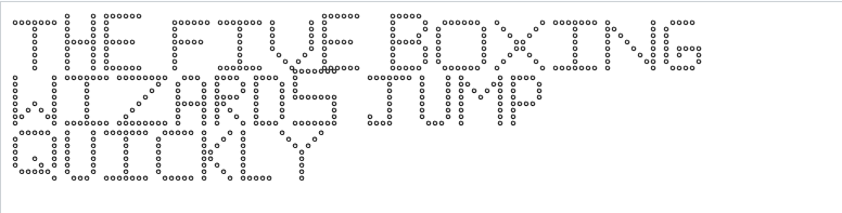
2nd Runner Up

Our 2nd Runner up was the i-dont-feel-so-good font made by GarrettTheHuman from Sequoia Middle School in Newbury Park, CA! Putting aside the funny Avengers reference, GarrettTheHuman took some interesting risks with this font that helped it stand out. The way the lines curl on some of the letters like E, I, and T makes this font resemble Chinese characters used in both classical and modern writing. We imagine this font being used in a kung fu blockbuster. We also liked how much the capital L resembled the font designed for the popular video game, Half-Life. Awesome work, GarrettTheHuman!
Our honorable mentions go out this month to:
- I.young used fontstruct to design this practical font.
Our Grand Prize winner will receive a $50 Adafruit Gift Certificate for their school, and our 1st and 2nd Runners up will each win a prize of their choice from our new prize chest.
Spring’s finally here and summer’s not far behind! Let’s celebrate our planet and the many wild creatures who inhabit it. This month your challenge is to design a virtual pet in Scratch!